The Creative Ranch | Brand Identity
Agency: Third Wheel Studio
Role: Creative Director and Design Lead
Team: Zach Wiley (Co Design Lead)
Radical Health is a community organization based out of the Bronx that aims to provide radical change to a broken healthcare system. They’re working towards health equity by opening up the dialogue with a real-time text app that allows users to ask healthcare related questions and circle conversation practices — all at no cost.
As part of an ongoing initiative to provide support to local organizations, TheLab partnered with Radical Health to provide a rebrand that would elevate its identity and set it up for success.
We collaborated closely with the team at Radical Health (even participated in a circle practice together) to make sure their mission was clear and bold and that the design system was vibrant to reflect the community. We conducted various research interviews with people throughout different healthcare spaces, within the community, and those who had experienced negative situations within the US Healthcare system to inform our creative decisions.

We wanted the logo to stand apart from traditional health-tech brands and highlight Radical Health’s personality.
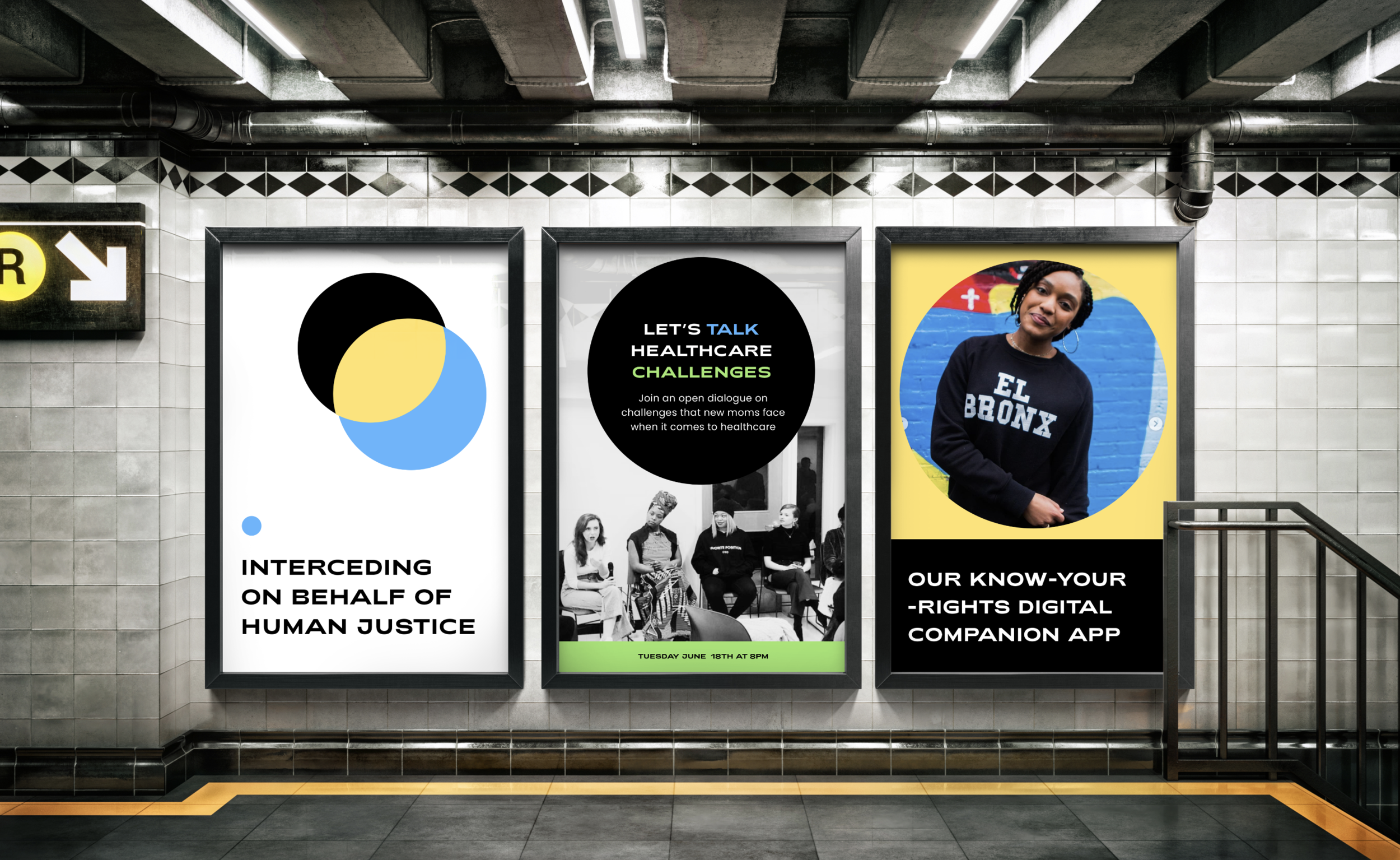
We chose a new brand font, Adieu, and incorporated an upside-down “i” that turned into a “!” to bring emphasis to the importance of their mission. The brand colors are bold and vibrant to reflect the community and are inspired by Bronx street art. We also leaned into a circle as a primary graphic element to highlight RH’s foundation in circle practices.


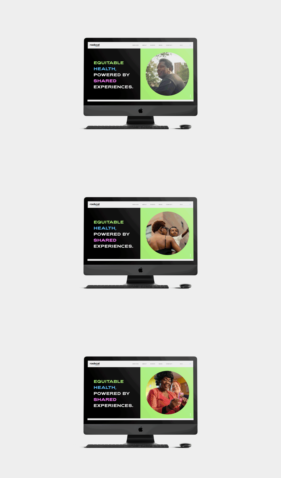
To help with the identity rollout, we built out a suite of samples to show how the brand would live across various channels.





We finalized the project with a brand book that outlined the new tone of voice, brand values, design styles etc. to set RH up for future endeavorers.
